Go down

Scroll to top

Fuenplaza

01

Ally

Founded in 1985, Fuenplaza Real Estate has become one of the leading real estate companies on the Costa del Sol, with an exceptional portfolio of properties based on the best quality and location standards.

02

The objective

Coinciding with the 35th anniversary (okay, we already know that it is said thirty-fifth), Fuenplaza proposes to completely update its identity, taking inspiration from its roots and adopting an innovative and timeless graphic style that marks the new stage of the brand.

03

The process

With the aim of presenting a solid, coherent and relevant image, the visual identity of the logo is redesigned, inspired by its previous version - a symbol of its legacy - from which a simple but memorable visual language is extracted.

Fuenplaza / Visual Identity / Graphic Design

Before After

Tradition. And innovation.

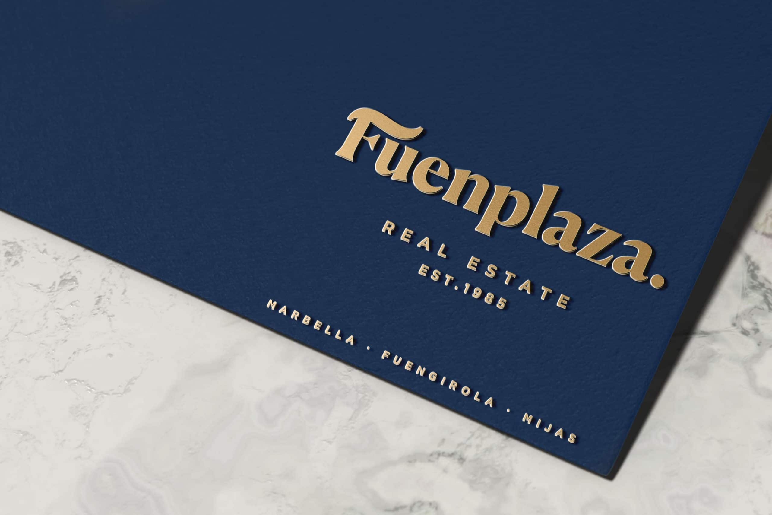
The conceptualization of the restyling for Fuenplaza adopts the most significant element of its classic identity, the letter F, adapted to a typeface with a thick serif that gives it a strong and solid character that also helps to reproduce the maximum legibility of the logo.

The redesign is completed with the taking of the golden color of its previous version, making it the predominant color of the new identity contrasted with the dark blue that is standardized in all materials.

Scroll

Visual development.

Once the new visual identity for Fuenplaza has been defined, it starts with redesigning all the graphic materials so that they extract the essence of the concept and also serve to unify the visual criteria of the brand. In this way, a visual language of its own is defined for the Fuenplaza Real Estate brand that shows a unified image that helps to position the brand in the mind of the consumer while generating brand coherence.

Post a comment

Your email address will not be published. Required fields are marked *