Conceptualization
Study and design of naming and adaptation to logo and Visual Identity of the WomanTech brand> / ®
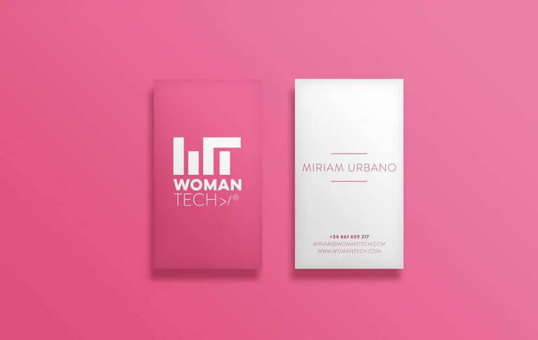
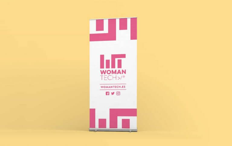
The identity is made up of a visual symbol that reflects the initials in symbology to the pillars that support the brand and the commercial name of the brand under which the activity is grouped.
WOMAN and TECH separate visually through the use of different fonts with the aim that, even if it is a single name, the two main aspects are reflected: Women and technology.


