Go down

Scroll to top

Nomad Art

01

Ally

Nomad Art is a multidisciplinary multimedia company that offers the highest quality audiovisual experiences both for the organization and production of private companies and for the design and commissioning of immersive experiences. A brand that counts in its history with the pride of having organized, executed and managed multimedia exhibitions of the stature of Van Gogh Alive or The Gold of Klimt in a multisensory experience in which the works of the artists come to life in traveling exhibitions throughout the national territory.

02

The objective

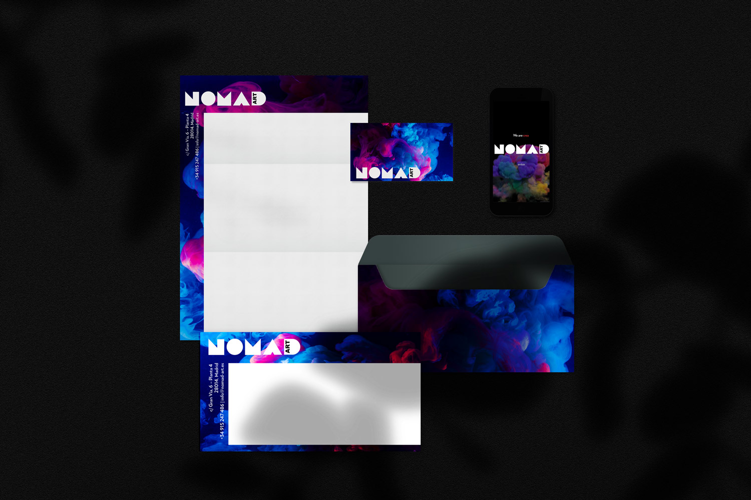
With the ultimate goal of establishing a brand that brings together the services offered by Nomad Art, at the same time that it represents a platform that shows the identity and values of the brand, it seeks to concentrate the identity and culture of the company in a single visual identity. that serves as brand recognition. At the same time, this brand must visually expand to generate a development of graphic materials that generate the visual universe of Nomad Art, culminating in the design and programming of a corporate website based on inspiration, interactivity and art.

03

The process

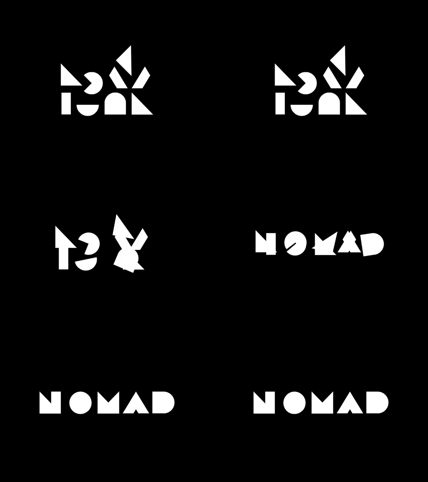
In a creative process that seeks to break with traditional concepts of brands related to art, Nomad Art's creative process begins with a de-construction of the artistic concept, shelving the services of the brand and turning it into pieces that mesh and unite in the brand Nomad Art.
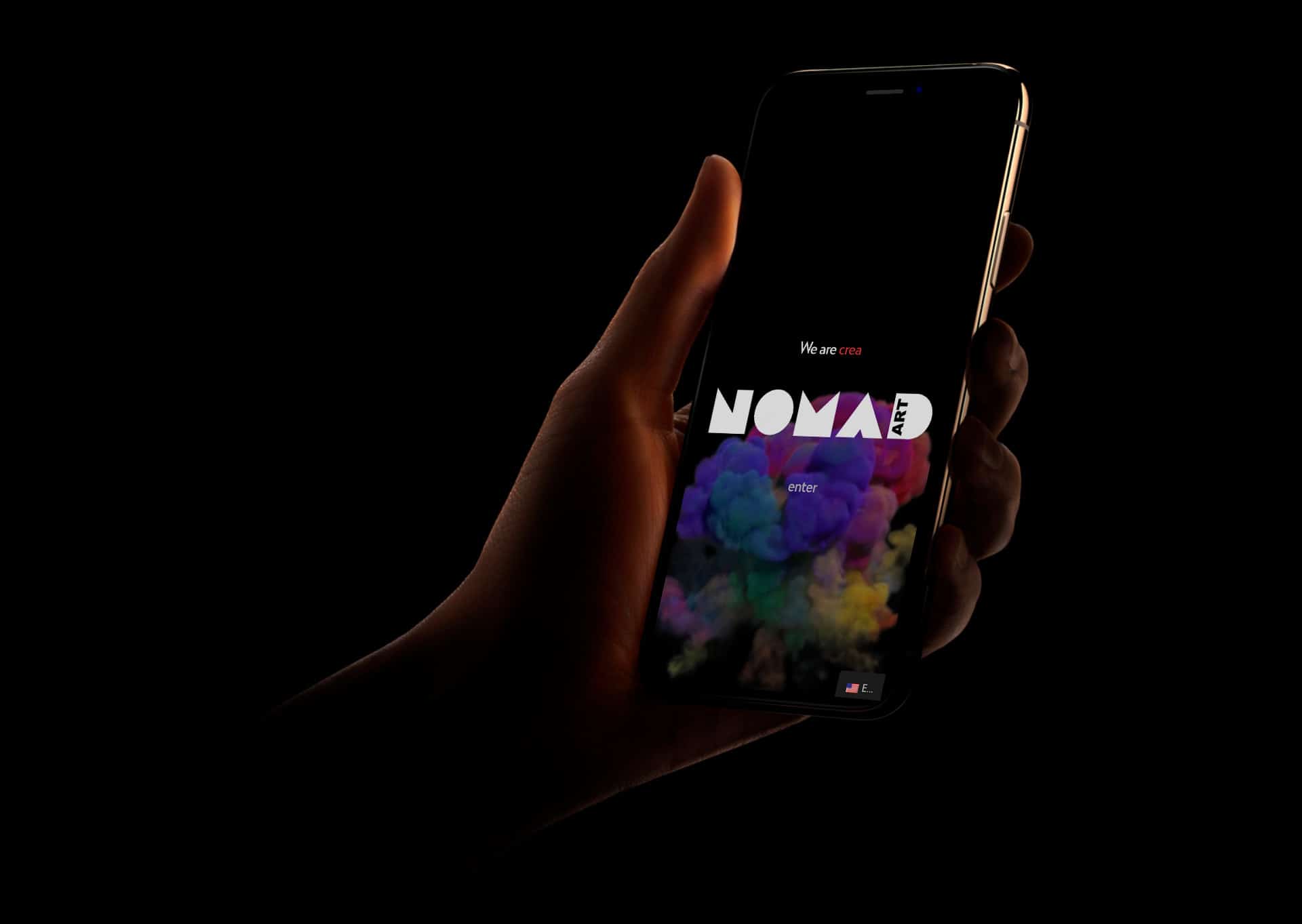
An explosion of art, design and visual elements that emerge and come together out of nowhere (represented by the color black) and interact in an explosion of color and artistic creation until defining a visual space full of color and movement, defining the visual concept of the company.

Nomad Art/ Visual / Web Identity.

Order and chaos

Nomad Art is characterized precisely by its multidisciplinarity in a sector as rich in elements as art. Nomad Art appears on the art scene to unite all those slopes and a priori disordered concepts (and that are represented by geometric figures that are different from each other; figures that rotate, turn and are arranged in a solid configuration that builds the name "Nomad" giving as The result is a visual identity that brings together and orders chaos in a simple, minimalist and structured final visual representation.

Structured navigation

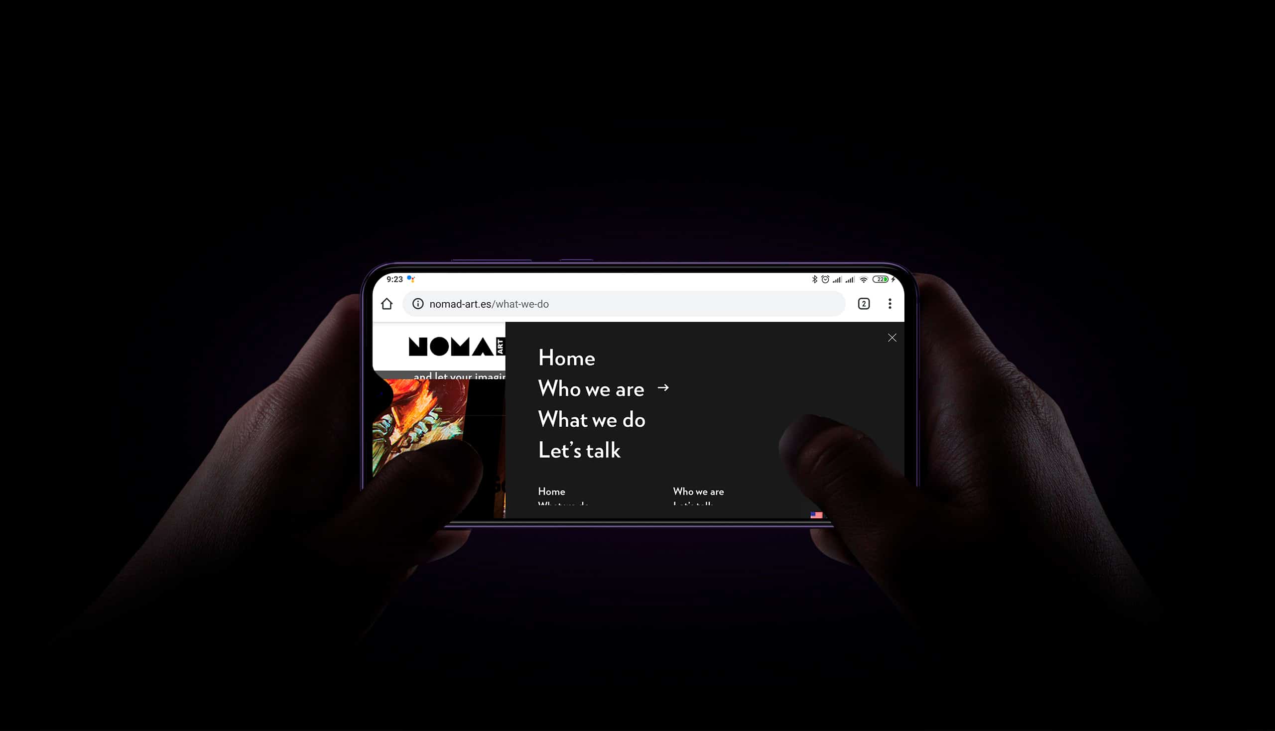
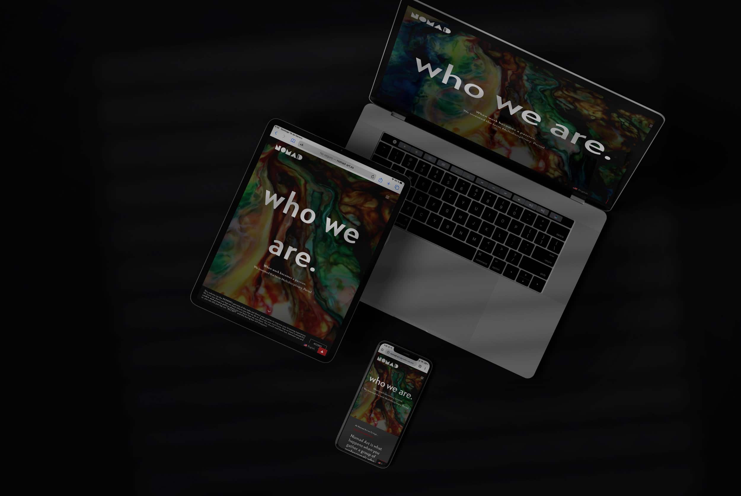
When it comes to transferring the concept of identity to the Nomad-Art website, the value of structure, simplicity and ease of user experience is maintained as a structural pillar of development.

With this objective in mind, the website is structured based on 2 clear concepts: Who We Are and What We Do, summarizing in them the entire philosophy of the brand.

Movement (responsible)

Nomad Art's conceptualization is based on the concept of order and movement. In web design and development, they are therefore two structural points that must prevail in each section. The simple structure and the block design contribute to reflect the order but, the case of the movement could lead to alter this order and simplicity.

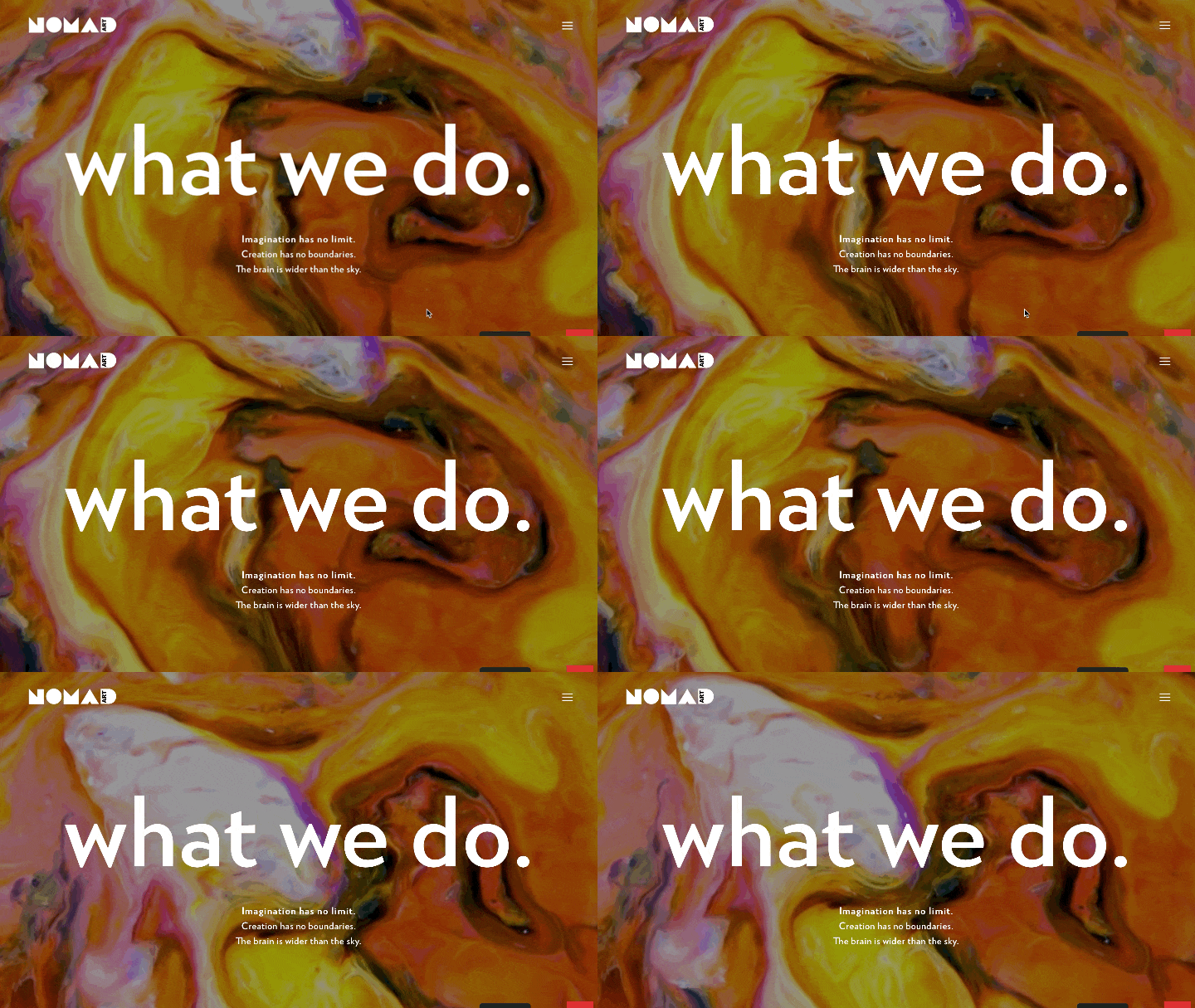
For this, it is decided to structure each section with a different header that reflects a movement of paint, smoke, in an explosion of color that precisely reflects the movement and dynamism of the brand in a responsible visual configuration (responsive) that is maintains and expands on all devices.

Post a comment

Your email address will not be published. Required fields are marked *