Balance
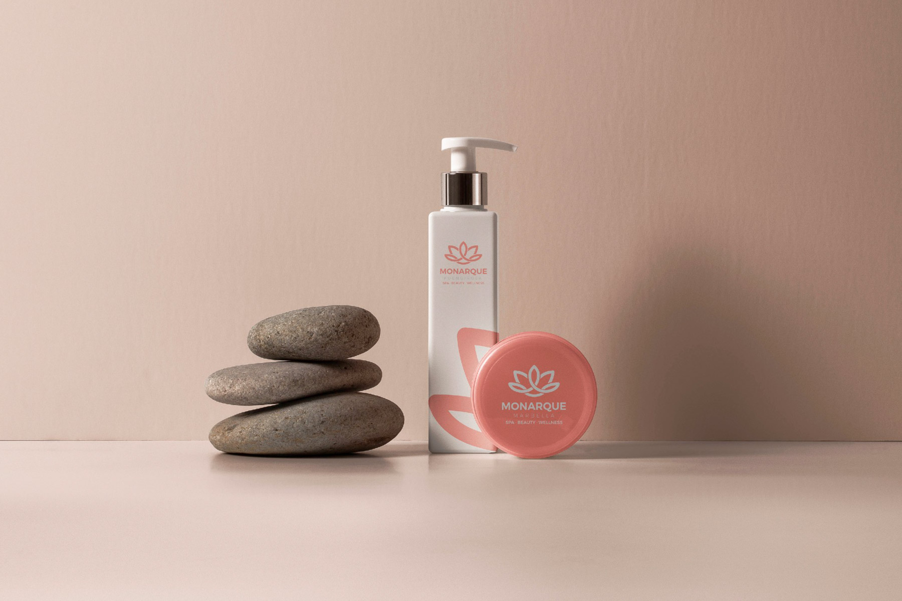
With the intention of communicating the objective message of Monarque Spa, it starts with defining a symbol that is directly associated with balance and balance as analogies to emotional stability.
To do this, we start from the figure of the "lotus flower" commonly associated with well-being transformed to be assimilated to a crown in order to associate it with the name of the brand, Monarque.
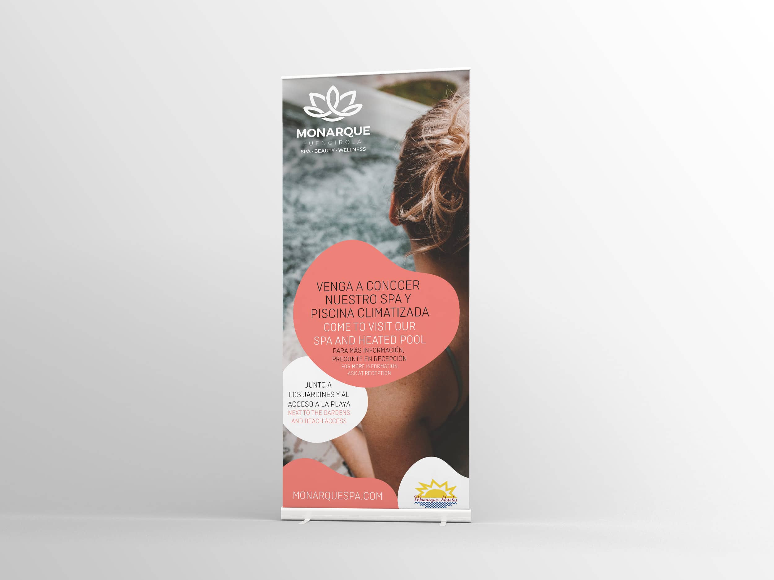
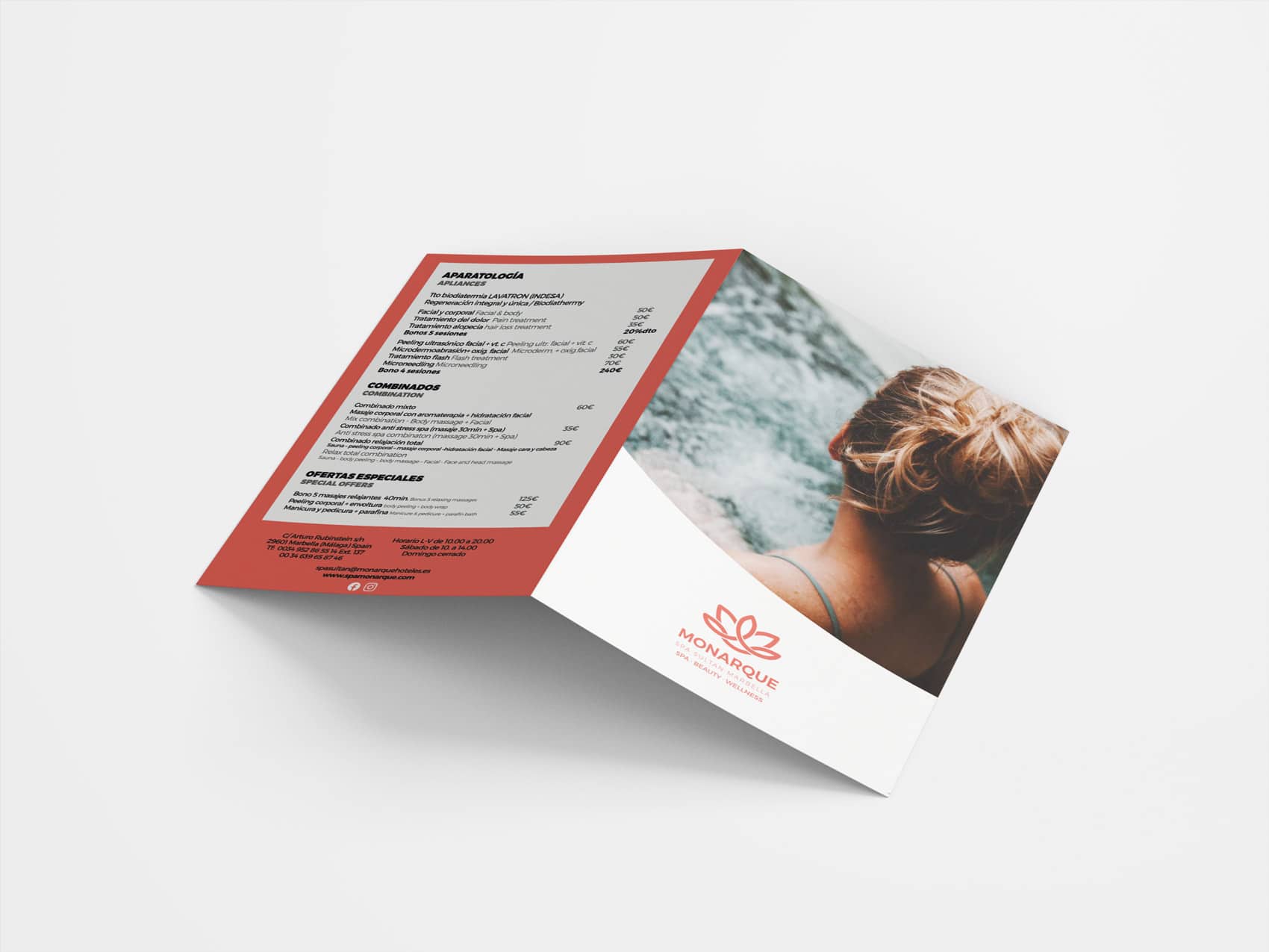
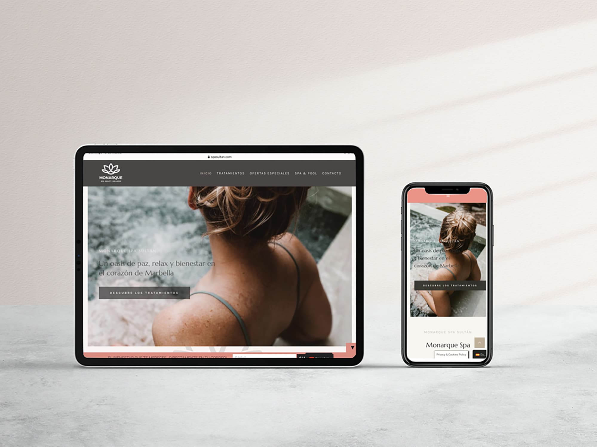
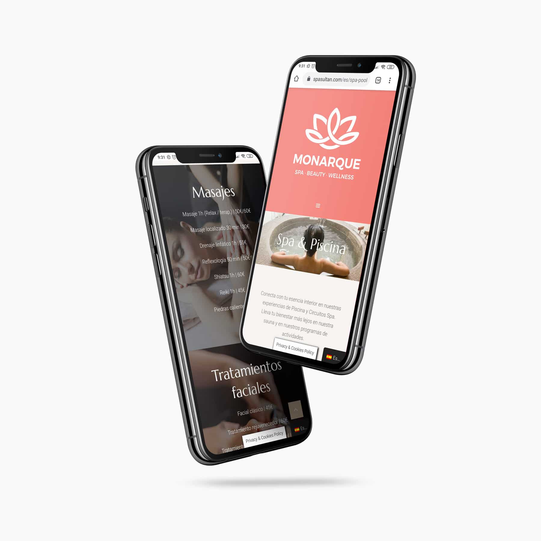
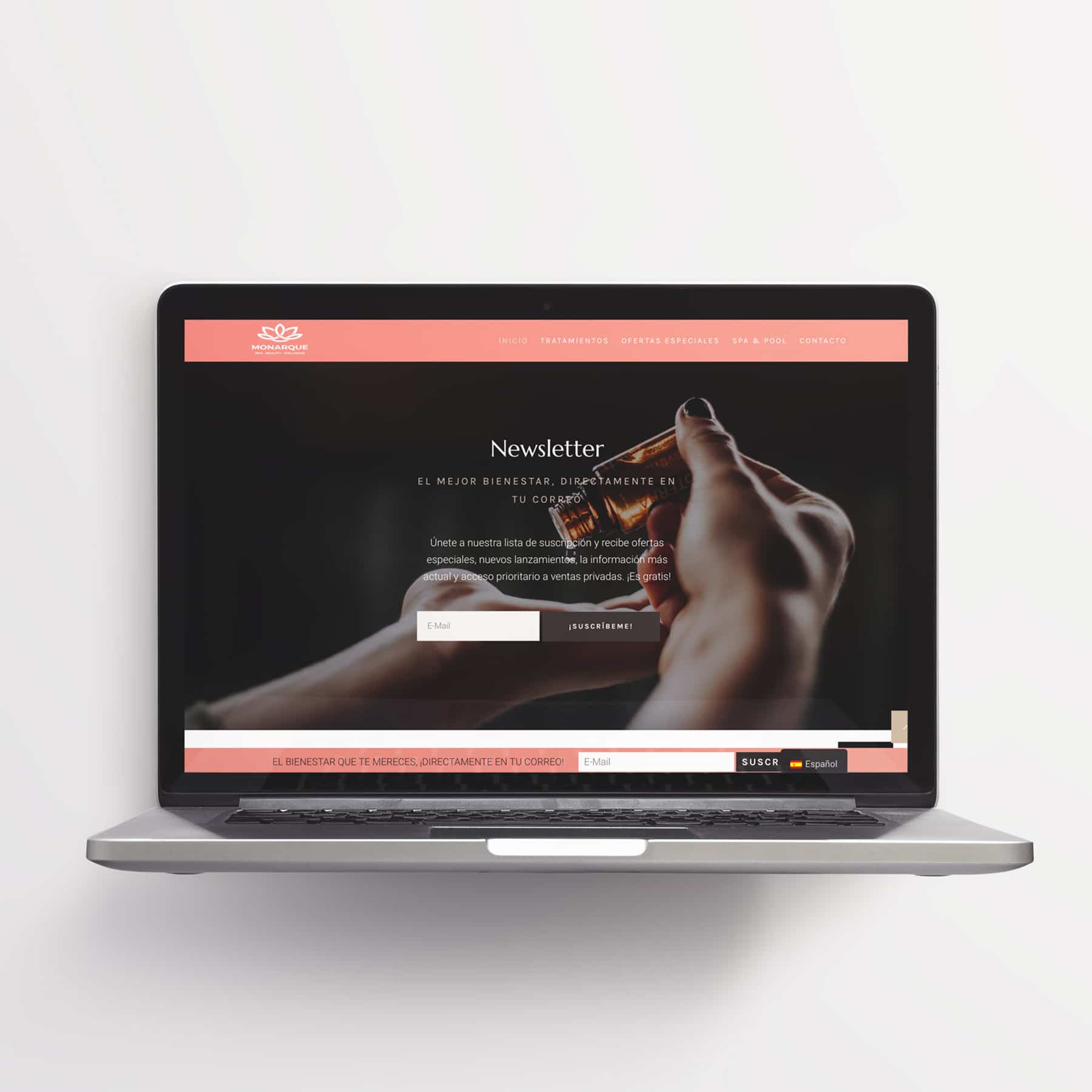
Finally, a visual configuration is defined in which the thicknesses and weights of the fonts help define the visual path of the brand, creating a balanced and stable set. Principles and values that are communicated through the rest of the graphic materials and that are made even more visible in the Monarque Spa web design in which the visual elements are grouped in boxes and modular spaces that seek the greatest visual stability.


