Go down

Scroll to top

ALDENTE Italian Gastronomy

01

Ally

AlDente Italian Gastronomy is established in Ciudad Real as a wholesale and retail center for the sale of Italian gastronomic products. A food-retail concept in which a catalog of all kinds of products from the country is opened that combines the Horeca channel, through the sale of Italian products, restaurants, food and tourism sectors, with direct sales to the final public, promoting the knowledge of Italian gastronomic culture and avoiding the typical pasta and pizza clichés, through the promotion of activities, tastings and tastings of Mediterranean gastronomy products.

02

The objective

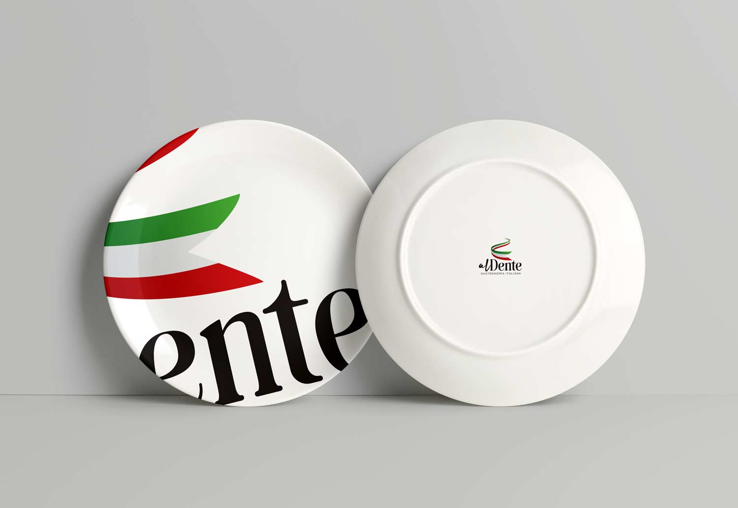
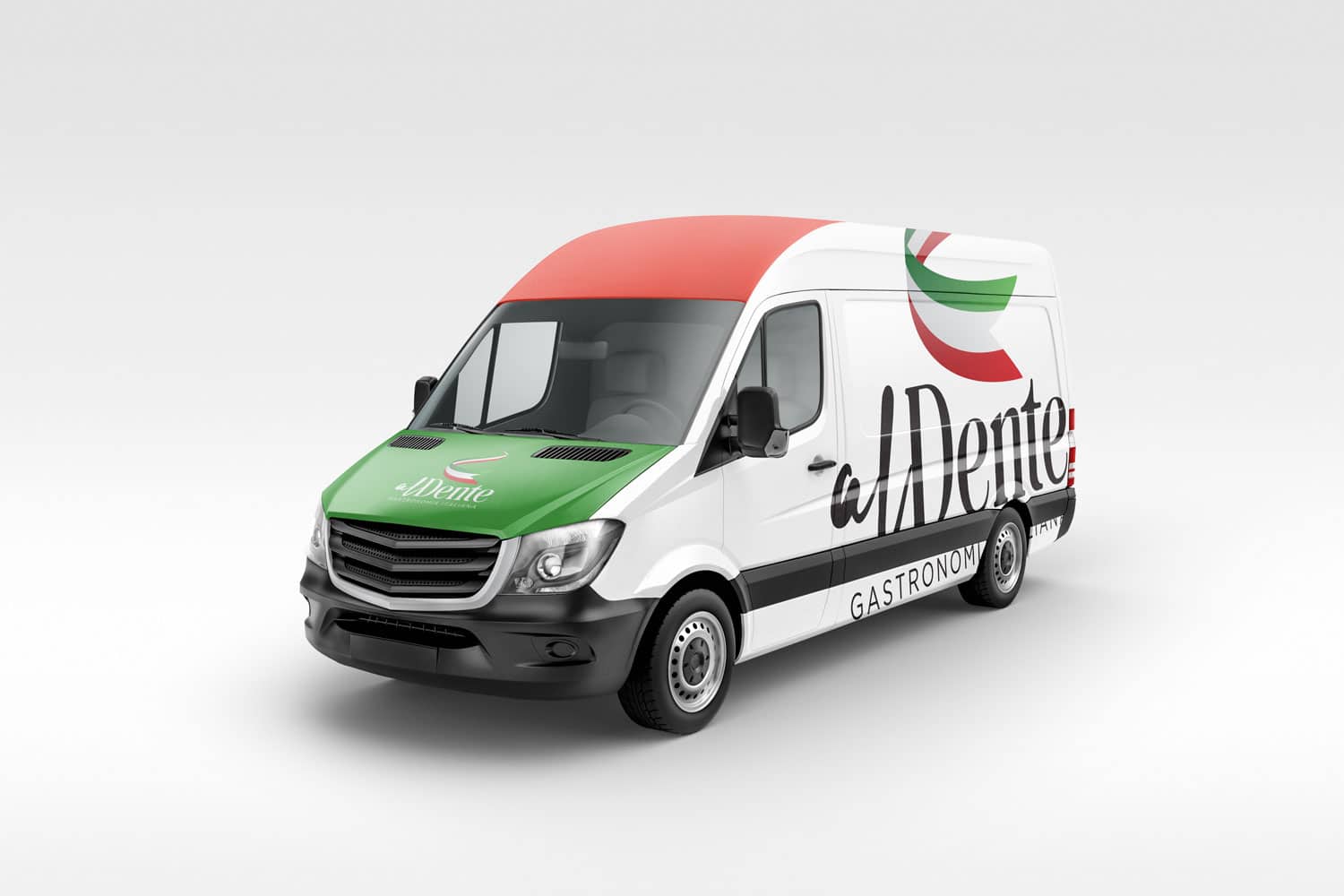
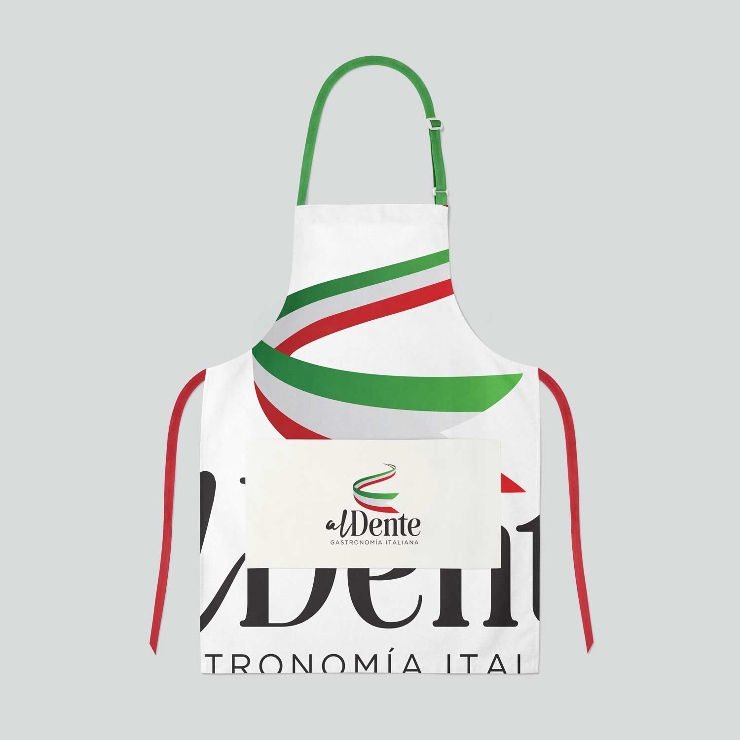
Create the visual identity of AlDente Italian Gastronomy through visual references to the “Italia” country brand, betting on a dynamic, visual and versatile concept that is reflected beyond the logo and transcends to create a clear, uniform and homogeneous visual line of easy reproduction both in packaging elements and in posters and communication pieces.
A concept that defines the AlDente Italian Gastronomy brand and advocates a visual concept that is easily recognizable and prepared for any adaptation and graphic need that may arise for the brand.

03

The process

With the clear intention of relating the country to the brand, we start from the need to use the White, Green and Red tricolor resource of the flag, taking advantage of the fact that the Italy country brand has managed to recognize this chromatic configuration in the general public.
In order to soften the presence of these three colors, the only use of black is pursued for the rest of the communication and the necessary graphic materials are established that configure the visual line adapted to their graphic needs.

Al dente/Visual identity

The taste of Italy

The identity seeks to represent the Italy concept as the basis on which to configure the rest of the visual identity.

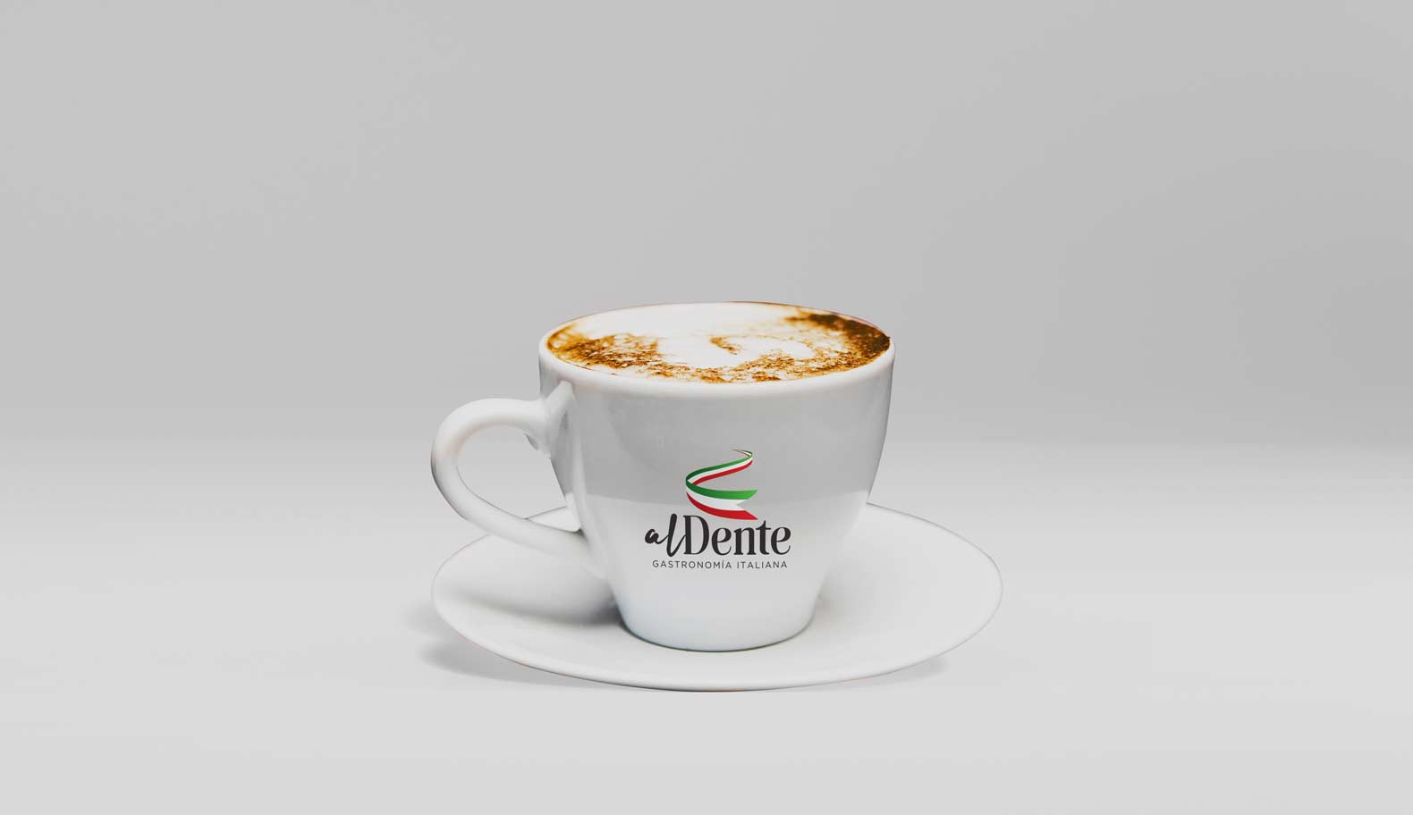
In this way, a tricolor ribbon is configured that symbolizes the steam boiling in the cooking process of Al dente pasta in which, as a banner, the colors of the Italian flag are integrated.

From this symbol, the name of the brand is configured, which plays with a typographic break between "Al" and "Dente" through the use of different fonts; one handwritten, as an outline, that projects dynamism, originality, craftsmanship and freshness, while the other, serif and thicker, is related to the most classic fonts, providing tradition, rigor and quality.

Post a comment

Your email address will not be published. Required fields are marked *