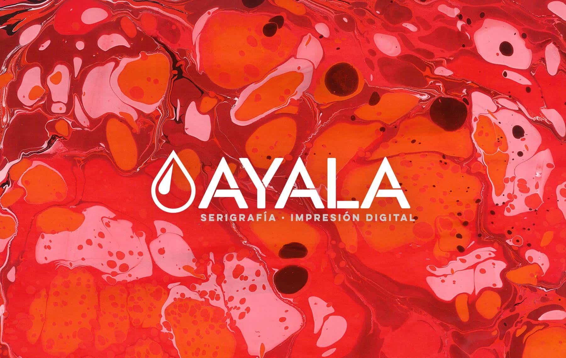
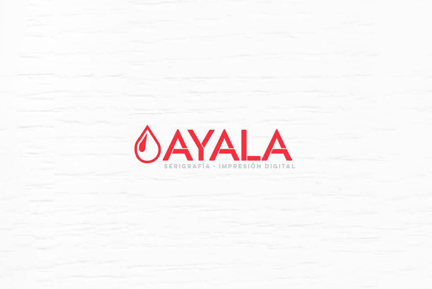
Go down

Scroll to top

Silkscreen Ayala Madrid

01

Ally

Serigrafia Ayala, founded in 1982, is a company dedicated to Serigraphy, Digital Printing, Labeling and Pre-printing and paper handling. Based in Móstoles (Madrid), Serigrafia Ayala works with leading brands in its sector, always advocating for the quality and detail of their productions.
With first-rate services, and working for companies in the international sector, Ayala seeks a change in its visual and web identity that allows it to renew and update its presence in the market.

02

The objective

After more than 10 years using the same logo, the advancement of trends and design style had accentuated the gap between the modernity and advancement of the product and the visual identity of the brand. Given this, the aim is to achieve a restyling that maintains the essence of the brand and that collects the values of seriousness (reliability) that determine the history of the brand.
After that, the total adaptation of the materials is sought in a process that will culminate in the redesign of its commercial website.

03

The process

The process starts from understanding the changes in the brand structure that Ayala has undergone over more than thirty years with the aim of conceptualizing a current redesign that helps to communicate the values of the brand.
Starting from the proposed concepts, a visual code is articulated that prevails in each of the new pieces that the company develops, which makes it necessary to find a clear and defining visual communication that is later combined in web development.

Ayala silkscreen/ Restyling Visual / Web.

Before After

Conceptualization

Starting from the logo design, it is necessary to look for a symbol that groups all the services of the brand and that serves at the same time as a differentiating and recognizing element of the brand. In this way, the concept of drop is reached as a symbol of its main unit –silk-screen printing– while the name acquires a typeface typical of the Lettering with broken letters that are reminiscent of the labeling templates, a symbol used to denote the other main activity of the brand.

Renaming.

In the first place, and due to the extension of the brand throughout its business evolution, the fact that SERIGRAFÍA AYALA has more services than screen printing itself, the redesign is recognized based on a change in naming, adopting AYALA as the name brand name to which is added the descriptive "Screen Printing and Digital Printing", a branch that encompasses not only current services but also the essence of the brand in case it continues to add services to its portfolio in the future.

Previous web study.

The Serigrafia Ayala website was based on a technological structure that is now ancient and a redesign is proposed following current trends in programming and design.

Web redesign.

The new Serigrafia Ayala website advocates a modular design, fully adapted to all devices, integrating all the brand values and the new defined graphic style.

Post a comment

Your email address will not be published. Required fields are marked *